Candlestick charts were originated in Japan over 100
years before the West had developed the bar charts and point-and-figure charts.
In the 1700s, a Japanese man known as Homma discovered that as there was a link
between price and the supply and demand of rice, the markets also were strongly
influenced by the emotions of traders.
A
daily candlestick charts shows the security’s open, high, low, and close price
for the day. The candlestick’s wide or rectangle part is called the “real body”
which shows the link between opening and closing prices.
This
real body shows the price range between the open and close of that day’s
trading.
When
the real body is filled, black or red then it means that the close is lower
than the open and is known as the bearish candle. It shows that the prices
opened, the bears pushed the prices down and closed lower than the opening
price.
If
the real body is empty, white or green then it means that the close was higher
than the open known as the bullish candle. It shows that the prices opened, the
bulls pushed the prices up and closed higher than the opening price.
The
thin vertical lines above and below the real body is known as the wicks or
shadows which represents the high and low prices of the trading session.
The upper shadow shows the high price and lower shadow shows
the low prices reached during the trading session.
There are 30 types of Candlestick charts, but we discussed 2 candlestick in 1 blog
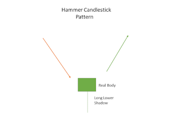
Hammer:
Hammer is single candlestick pattern which is formed at the end of a downtrend and signals bullish reversal.
The real body of this candle is small and is
located at the top with a lower shadow which should be more than twice of the
real body. This candlestick chart pattern has no or little upper shadow.
The psychology behind this candle formation
is that the prices opened and seller pushed down the prices.
Suddenly the buyers came into the market and
pushed the prices up and closed the trading session more than the opening
price.
This resulted in the formation of
bullish pattern and signifies that buyers are back in the market and downtrend
may end.
Traders can enter a long position if next day a bullish
candle is formed and can place a stop-loss at the low of Hammer.
Piercing
Pattern:
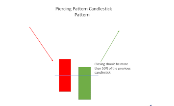
Piercing pattern is multiple
candlestick chart pattern which
is formed after a downtrend indicating bullish reversal.
It is formed by two candles, the first candle being a
bearish candle which indicates the continuation of the downtrend.
The second candle is a bullish candle which opens gap
down but closes more than 50% of the real body of the previous candle which
shows that the bulls are back in the market and a bullish reversal is going to
take place.
Traders can enter a long position if next day a bullish
candle is formed and can place a stop-loss at the low of the second candle.
Happy Trading & Happy Investing


No comments:
Post a Comment